This week I’ll be delivering a “poster session” presentation at the Interstellar Research Group (IRG) meeting in Tucson, Arizona. As the name implies, I’ll be presenting with a poster on hand as a visual aid. Compressing a multi-page paper into a poster required multiple iterations and several weeks’ worth of work. Today I’ll take you through some of that process, which eventually culminated in a final version by my conference coauthor, Stuart Feldman. It’s been a learning experience, as I knew and hoped it would be.
The Terrible First Drafts
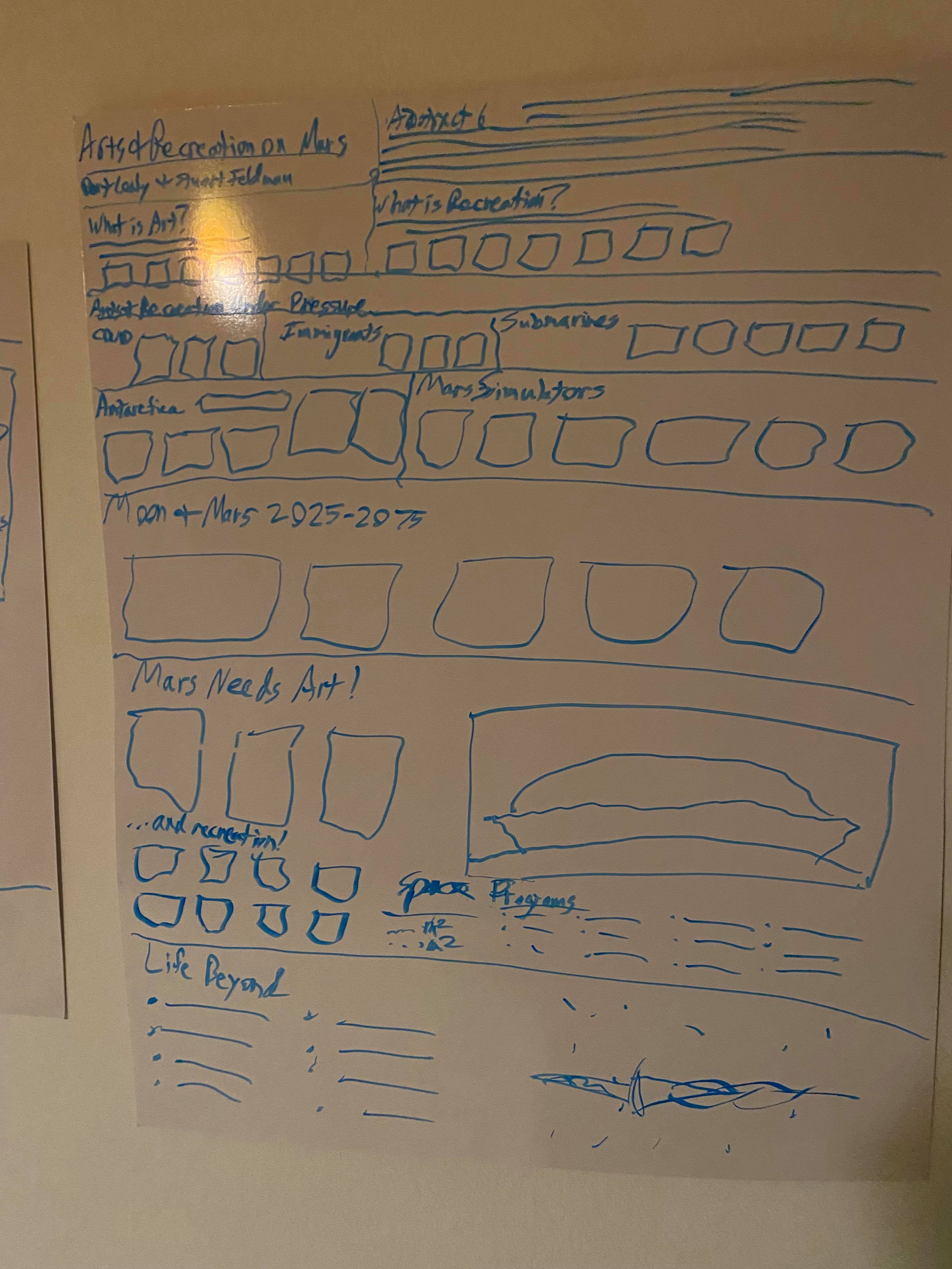
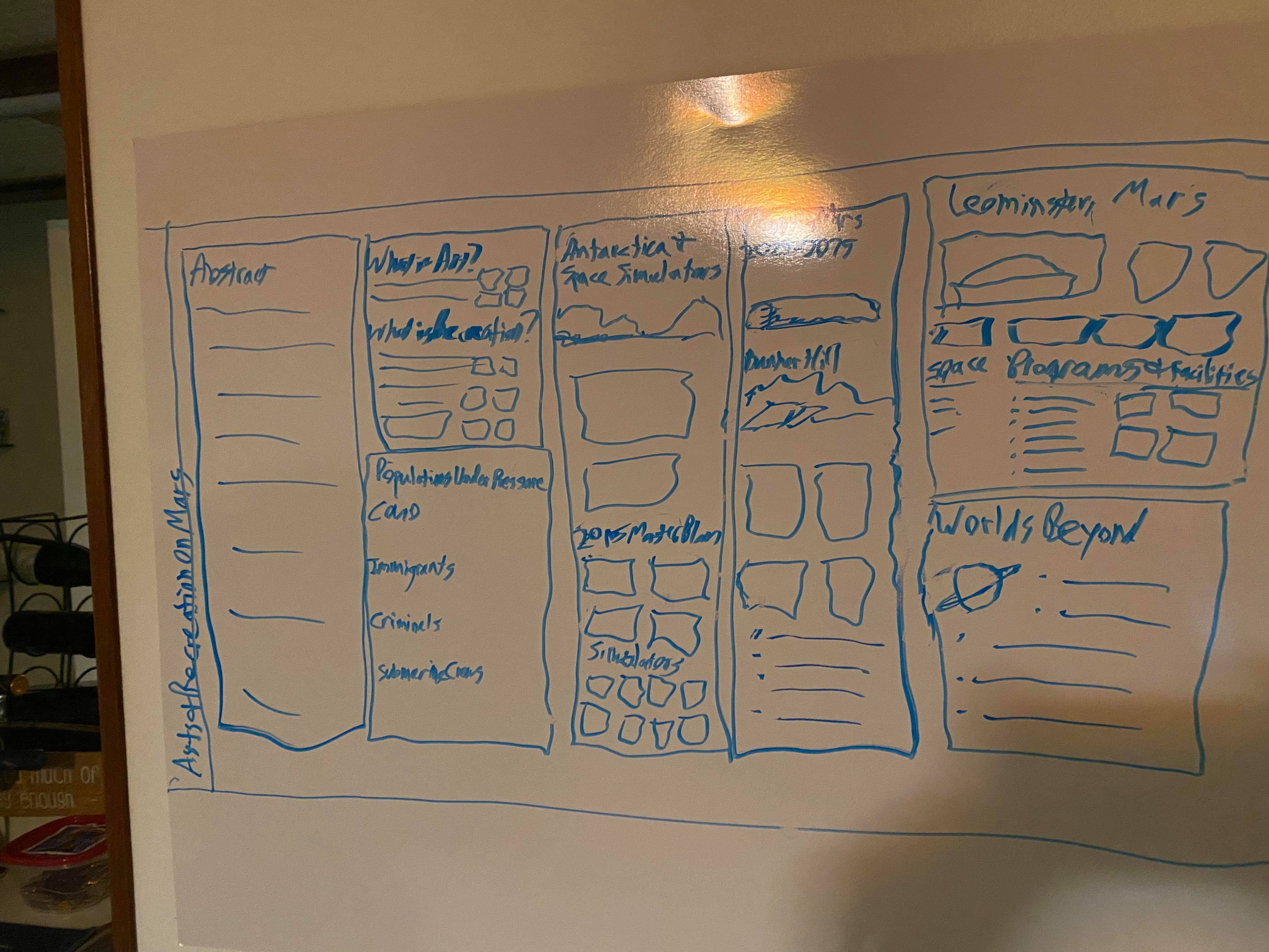
The paper I wrote for Kepler Space Institute ran 74 pages; the version I established for the conference was a bit shorter because I eliminated the entire survey section. Still, at 65 pages, this was not going to be a quick or easy paper to summarize on a single piece of paper because I had a lot to research and say. I decided to review the table of contents and write my thoughts on a couple of actual poster-size whiteboard sheets before I started working with electrons. I experimented with portrait and landscape views. Most conference posters are in portrait orientation, but landscape orientation is a more cinematic experience, and this English major likes movies, so…
From the paper version, I turned to PowerPoint, which was flexible enough for me to exercise what graphic design skills I have. And while I will be showing five different versions below, I’m simplifying somewhat because there were multiple sub-versions (X.1, X.2, X.3, etc.) along the way as I tweaked language and formatting.

I modified the handwritten poster somewhat, but the outcome was a bit flat. This was just an attempt to fit everything onto one page. Lots of words on the page, and things look crowded and a little boring. And the scary part was that this wasn’t everything I wanted to say!
In draft two, I added dark orange text for the color of Mars. I also moved the summary table into a separate, smaller image with a different color scheme to call attention to its contents; that was, after all, the bulk of my research. I also added a couple more pictures besides Stuart’s depiction of the Leominster city on Mars, incorporating some additional images by the Mars Foundation.
 By changing font sizes, I was able to add more data about the planet Mars and a section for the intended outcomes of my paper’s recommendations.
Version 3 included a full-length orange title banner, the author names, and a row of images at the bottom to convey the types of arts and recreation covered in the paper

This represented my “peak text” approach, as well as my final thoughts on the topics I wanted to include in the poster. However, it still felt flat and crowded to me.
Before taking time off for the Labor Day holiday, I tried for a more “artsy” look: more images, a more unconventional layout, and creative text wrap-arounds. My biggest gripe with this version was that while it was visually interesting, it did not give the unfamiliar reader an easy way to navigate or read the page. You might start in the upper left, but where do you go from there? To the right or down?
It was at this point I handed off the poster to Stuart so he could apply his industrial design mindset to the finished product. We got on the phone and discussed what was going on with the poster and what I was hoping to say to this audience, which is primarily science and engineering professionals interested in the subject of interstellar travel and migration. I found that talking about things aloud allowed me to simplify my message still more. Details about Leominster and Mars disappeared. And, more importantly, I found a way to make the poster more “readable” visually. I planned to repurpose my little arts and recreation icons to connect with the subtopics I had researched (I wasn’t planning on using the same icons for each one).
One of the spontaneous comments that erupted from my mouth during our talk was, “If we’re not having fun [migrating into the cosmos], what’s the point? Why bother?” That became the closing line to end the poster. I submitted this post-discussion version to Stuart:
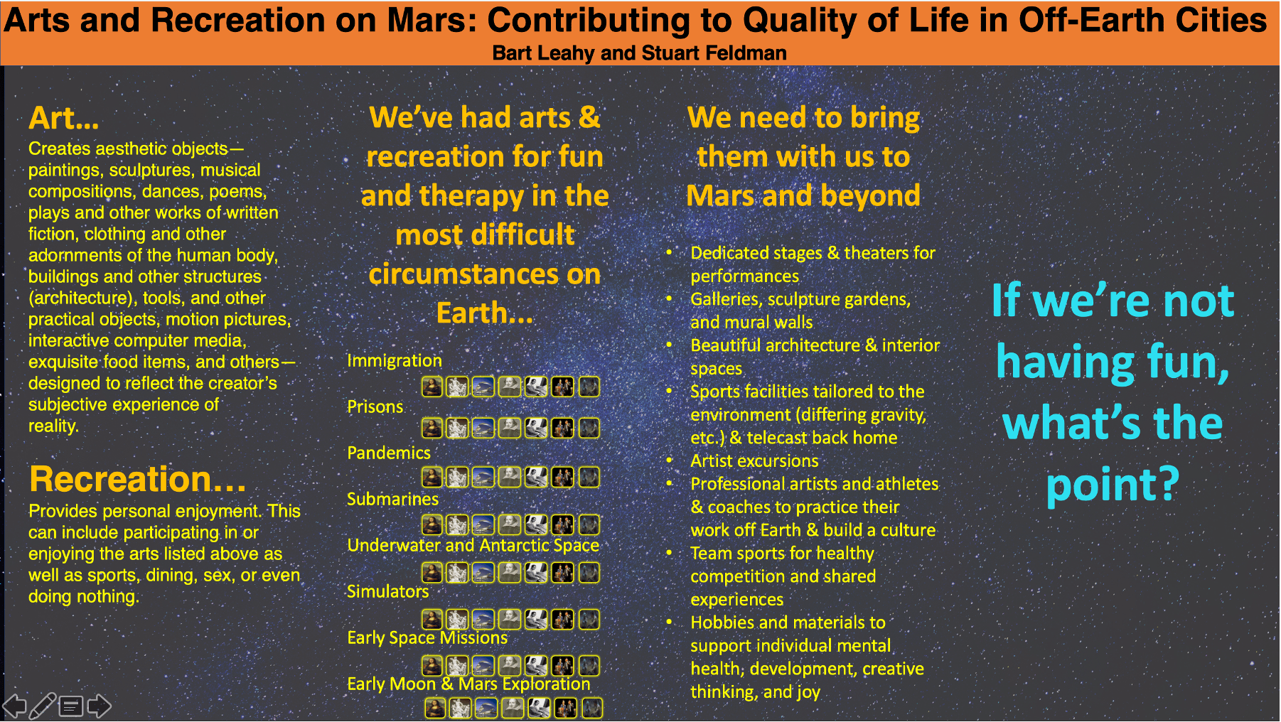 Stuart then turned on his designer’s brain and produced the final version:
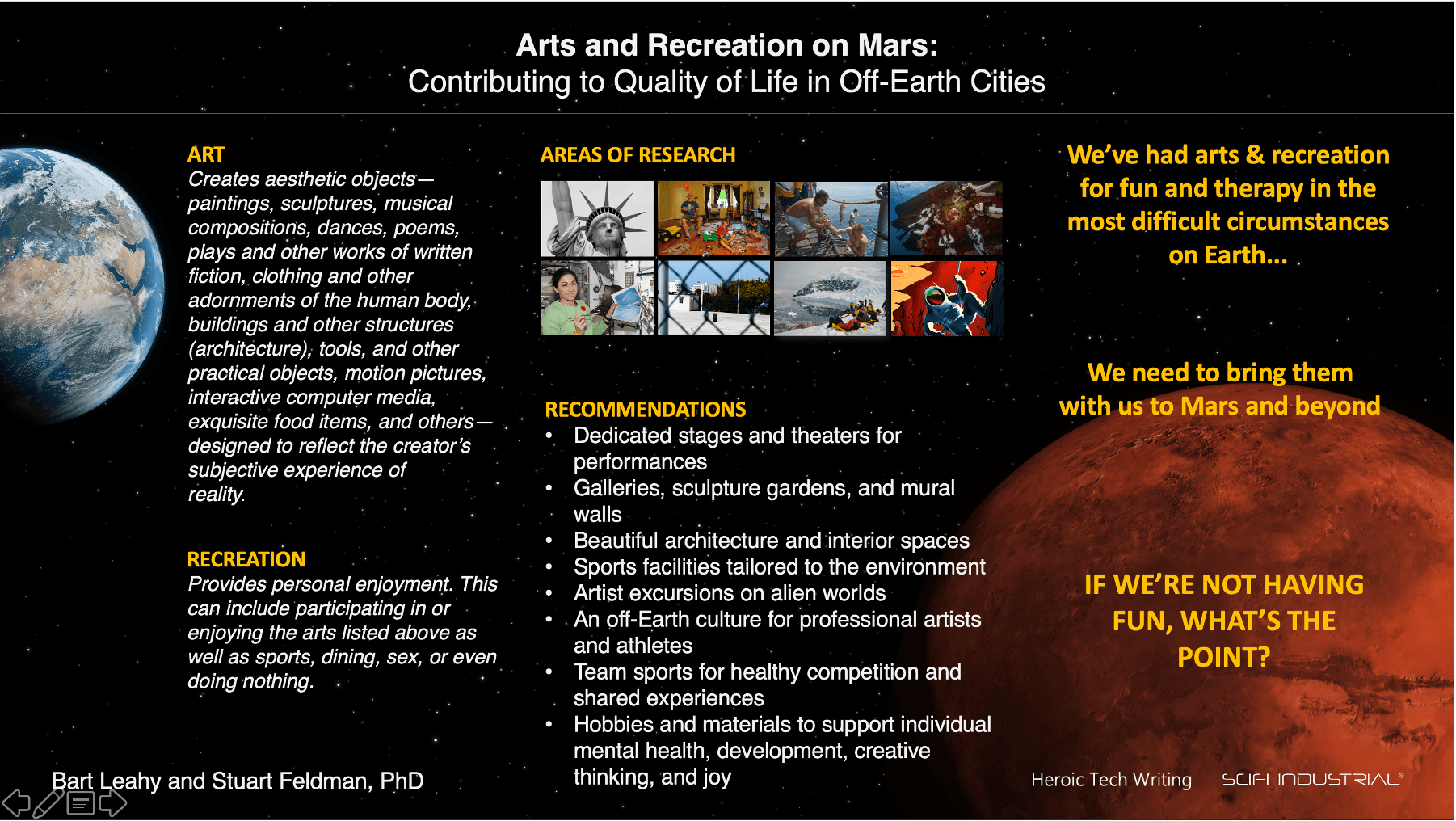
Curiously enough, the final version ended up looking a lot like one of my original handwritten drawings. Stuart kept my four-panel view; found a darker, subtler star-field background that wouldn’t overwhelm the text; added better Earth and Mars images; and condensed my areas of research into images only. He also added our respective brands/companies to the bottom-right: Heroic Technical Writing and his solo enterprise, SciFi Industrial. Readability was greatly simplified, and the main points appear in the concluding panel.
Lessons Learned
Has the paper changed? Actually, not much. I removed the survey, as I noted above, and added a sentence or two including the tag line at the end of the poster. What changed was how I would talk about it.
It was incredibly helpful working with Stuart because I was able to identify the main points across and tighten up the “visual language” of the poster so that it told my “story” clearly and simply. I’m glad I started as early as I did–a month out–to give myself and Stuart some time to work through the content and clarify the highlights. This will undoubtedly be a much simpler poster than a lot of the other presenters at the IRG, and that’s fine. As with the paper itself, I’m trying to reach a broader audience than just people who love space. Therefore, there are more pictures, fewer equations, and simpler language than other topics being delivered at the conference. Will it sell? That’s a subject for another day.
 Copyright secured by Digiprove © 2021 Bart Leahy